Autobiographical Art: Designing the cover of my fictional autobiography
How would you design the cover of your autobiography?
This was a question posed by creativity coach Rod Judkins during lockdown and it really got me thinking. How would I design it? I knew immediately that I’d like it to encompass the first part of my life when I was in the corporate world of IT projects with little call or desire to be creative (or so I thought) and the more recent part of my life where art plays a big part.
Research
I wanted to know how the left and right brain influence each other? How was it possible that I spent a big chunk of my life with the right side of my brain being inactive but now seemingly very active. It seems that this whole left-brain-right-brain thing is largely a myth and that we use both sides of the brain for most activities.
With the initial line of enquiry at a dead end, my research led me to The Runaway Species book written by David Eagleman and Anthony Brandt. They consider why we are unique amongst living creatures in the drive to create and what creativity is. I found myself relating to so many of the principles and instead of finding differences between my way of working in the corporate world and in my artistic practices, I could see only similarities.
My design objectives
Even though it took some time for me to settle on a design for the cover of my autobiography, I knew it should reference the landscape which has been a big source of inspiration, my career in IT and my art making. I was looking to make a cover that would be a metaphor for my creativity.
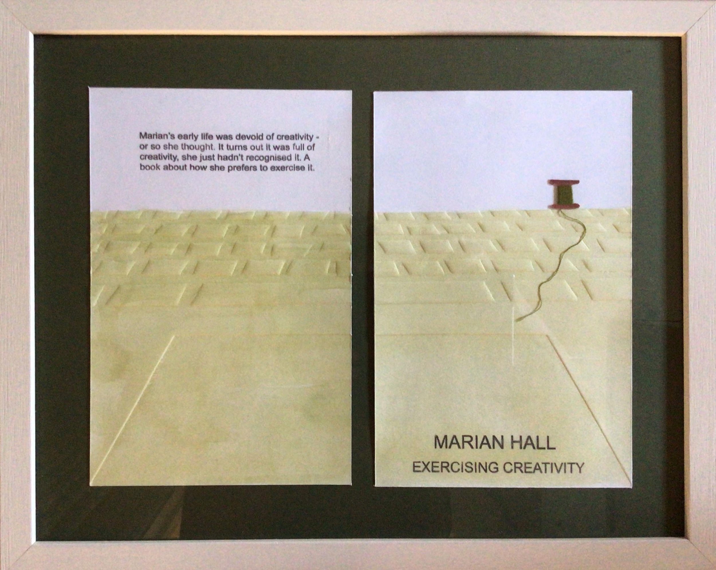
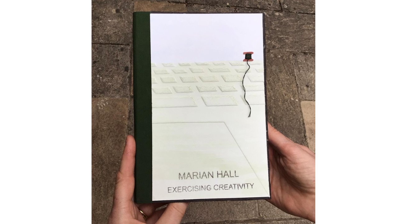
Why I think the book cover speaks of me (see first image)
The book cover has a look of simplicity and spaciousness, a look I increasingly favour but one that still takes me a long time to design and create. The horizontal structure and the colours of the design suggest an open landscape, often a source of inspiration for my artwork. The embossed keyboard represents the importance of IT in my life. More obviously it was a feature of my job in the corporate world, but it also plays an important part in my art, providing the tools to mock up designs, eliminate background clutter from my photos, research new projects, maintain a website and much more. Even in creating this relatively simple design, I have digitally manipulated the keyboard image to give the impression of it receding into the distance.
The cotton reel on the horizon reflects my love of stitch and the colour in the landscape has been painted on, a method I sometimes use with dye on fabric. Print is key to my practice and the embossed cover was created by passing the paper through the press without any ink.
I have called my fictional autobiography ‘Exercising Creativity’ because of the realisation that I have been exercising my creativity for much longer than I thought. The summary words on the back cover read:
‘ Marian’s early life was devoid of creativity or so she thought. It turns out her life was full of creativity, she just hadn’t recognised it. A book about how she chooses to exercise it’
The book cover is part of the ‘Marking Our Way’ body of work, which was a collaboration with three other artists. You can read more about the collaboration, download the accompanying e-book and see other work in the series here.
What would be on the cover of your autobiography?


